Covers!
Studies have shown that the single most important factor influencing a buyer’s purchase of a book is the cover. (I’m talking about print books here—I haven’t looked at ebooks, which do have covers, which I assume are intended to catch the eye of a potential reader.) That’s kind of depressing, because most writers, at least those with larger publishers, have little control over what their cover looks like. If they’re very lucky, they get to see it in advance of publication, usually with a note from the editor that says something like “isn’t it adorable?” Not, “are you okay with this?”
Of course, you the writer have the right to respond and say, “But my protagonist isn’t blonde!” or “There are no pineapples in my book!” Too bad, because Marketing loves the cover, and they’re the ones who matter because they know what sells. We hope.
Of course, seeing the cover kinds of depends on where the publisher and/or the bookstore decide to place your book (that’s a whole different topic). If it’s face out, people will see the cover. If it’s spine out—you’re out of luck, unless the reader happens to buy only books with red spines and yours is red.
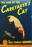
There are definitely visual conventions for book covers, not to mention “branding.” I’ll admit I’m drawn to the Twilight series because the covers are so simple and elegant—and recognizable from across the room. Thrillers tend to have embossed covers with shiny metallic patches—you see a lot of them in airport bookstores. And cozies have cats.
That’s not a bad thing. If a reader wants to find her favorite kind of fiction, she will recognize the cat as a key symbol (hmmm, the former academic side of me is thinking a paper called, “Feline Iconography in Genre Fiction”.) Or a cat plus a craft (knitting, crocheting), although I would argue that cats and yarn are a perilous combination. Or a cat plus food—most often dessert, because you don’t want a cat sitting next to a juicy pork chop, do you? Can you guess from this trend that most of these books are aimed at female readers? Men have been known to put false covers on them if they want to read them in public.
I’m not complaining, because most of my book covers have been done by a cover artist who speaks the (visual) language of the genre. Not that I know her personally—I had to wait for my first book to come out before I could identify her on the publisher’s page. (She’s Mary Ann Lasher, and she does a lot of covers for Berkley Prime Crime.) She does accept suggestions, and some have even made it to the covers, like the spring-house on Rotten to the Core (which is based on one I found in an orchard), and the goats on Bitter Harvest (August 2011). Yes, they’re real goats on a local farm.
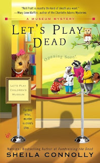
I threw her a real curve ball with Let’s Play Dead (July 2011), in which I invented a children’s book series featuring Harriet the Hedgehog and her animal friends, all of whom are actually critical to the plot. Mary Ann managed to get them all on the cover and still made it look like a mystery, with a sinister shadow looming.
Which brings up one last point: for cozies you’re not supposed to put anything suggesting violence or death on the cover, even though the point of the book is generally to solve a murder. That looming shadow is about as scary as you can get. No blood, no corpses, no ick. Just cheerful murders, with friendly cats.
Do you buy a book based on its cover? What do you look for?
_____________
Sheila Connolly, former art historian, investment banker, political staffer, genealogy consultant, and non-profit fundraiser, gave them all up to become a full-time mystery writer. Her first book, Through a Glass, Deadly (written as Sarah Atwell), was an Agatha nominee for Best First Novel. She writers the Orchard Mystery series, the most recent of which is A Killer Crop, as well as the Museum Mystery series, based in Philadelphia, which opened with Fundraising the Dead in 2010. In addition, she’s working on a new series set in Ireland, that will debut in September 2012. Sheila lives in Massachusetts with her husband, daughter, and three cats. http://www.sheilaconnolly.com/


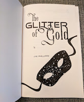

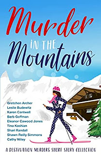

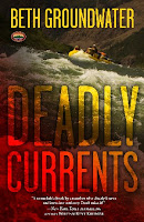
Thanks for coming by, Sheila. Ah, covers…the age-old publishing bugaboo. An eye-catching cover will definitely get me to pick up a book and thumb through it, and conversely, an unattractive cover will make me pass a book by. I guess I do judge a book by its cover! I hope potential readers out there are more open minded than I am. 🙂 Maggie
Love your cover.
I've had some good covers and some strange ones. Fortunately the two small presses I'm with are great about taking suggestions on the covers. The first cover sent to me for Angel Lost, the female jogger had long hair, the character has short so that was changed. She only jogged early morning and that's obviously sunset(CA) but it looks great so I didn't complain.
Marilyn
I love your cover, Sheila! I absolutely use the cover to form a first opinion of a book. It tells me the tone, the genre, and creates immediate reader expectation. Covers are super important. Studies show that book buying is based on a reader looking at the front cover for about 7 seconds, flipping the book over (or reading a blurb online), and MAYBE reading the first line or two. That's it. So you have to capture the reader's attention right out of the gate and the cover is the way to do it.
I am a cover person. Once I admire the cover, then I'm picking it up and if that blurb entices me, most likely I'm buying the book.
Hi Sheila, Great post! You kept me reading the entire way. I think your cover is the perfect depiction of murderously good fun! And your take on cover art, on target! I was lucky, when I got the jpeg & note saying, "Here's your cover, I hope you love it!" fortunately, I did.
I like to think I don't buy a book based on the cover, but it sure will make me pick one up!
Covers rarely influence my buying any more although they did some when I was younger. Most of my buying decisions now are influenced by people, people on DorothyL, people on Facebook, people on blogs, people on GoodReads. I find those that have similar taste and often try new authors based on their recommendations. It is a great world out there now, I'm finding so many good authors that I don't have a hope of keeping up — but I'm loving the chance to try! And, yes, Sheila, I have read your books, at least the orchard ones.
Hi, Sheila! Thanks for joining us today. The topic of cover art is always fascinating. I will pick up a book because of its cover…but I also read back cover copy to make sure it's something that would interest me (I might even read the first page to be sure). An ugly cover can definitely turn me off. But if I hear about a book that's great, I'll ignore an ugly cover and read it anyway. Still, I do think covers have an influence. There are just some that draw me in where others don't. Whether it's the colors, the graphics, the fonts, whatever, I couldn't say exactly. It's just like looking at a painting that makes me go "ah" vs. one that has me going, "ugh."
I pick my books by author, and genre. After that I look to see how the artists have interpreted the story to the front cover.
Absolutely do I love covers! It's what first draws me in and encourages me to select that book. I love much of what goes onto cozy covers, thrillers are often stimulating as are romantic suspense. It can be half and half with romance – some are beautiful and some fall short. But oh yes do covers matter! Great topic.
This comment has been removed by the author.
I must admit, I've never been able to NOT judge a book by its cover. My current equation includes the cover, the back blurb, and maybe a bit of the first page, but, yes, that image, cats or no cats, is what first gets my attention. I think it's almost sad that a Kindle doesn't have some kind of a digital image to showcase the cover of the e-book someone is currently reading!